My Chic Grand Millenial Dining Room Design

The dining room was one of the first spaces in the house that I was eager to refresh. To say I’m excited that it is complete is an understatement. Because I love hosting and entertaining, we spend a lot of time in our dining room. Between a dining room, an office, or a craft room, this dining room wears a lot of hats, so when I started on the design, I knew it needed to be both functional and pretty.
Shop the Room
[show_shopthepost_widget id="4296294"]

The Foundation of the Space
The very first piece that landed in the room, which was never intended for the dining room, was the wooden chest that I had restored. I didn’t really have a spot for it, so I placed it in the dining room as a temporary place holder. As it turned out, I fell in love with how it looked so much that I wanted to make it work.
Last year, I attended the Atlanta Holiday Home and I saw a room design that featured acrylic wall shelves and I fell in love. The designer stacked them in quantities of 4 and they looked great. A week later, as luck would have it, I was at a local outlet store and saw the exact same shelves for sale. I purchased them immediately. I decided to place 3 on each side of the chest because our walls aren't very tall. They rounded out the space out perfectly.
My next task was deciding what to place on top of the acrylic shelves. One of the things I have learned through my many years of decorating is that you typically shouldn't mix a shiny object with another shiny object, or a matte object with another matte.
Because the acrylic is shiny, I knew I needed to find a matte piece to place on them. I decided to use Suzanne Kasler for Ballard Designs' french lamp slips and they are the perfect size and color. They brighten up the wall flawlessly and have such a timeless and elegant look. Not to mention, they are fun to dress up for the holiday season. This Christmas, I decided to add mini wreaths to them to add some holiday cheer.
Still working around the chest, I knew that I wanted a mirror to make the space feel bigger. I searched and searched for a Chinoiserie Pagoda mirror. The ones I found were absolutely stunning, however, they were priced much higher than our budget allowed. The struggles of having expensive taste, am I right?

The Search for the Perfect Pieces
One day, I was picking up a Facebook Marketplace find from a lady, and she had a storage unit FILLED with gorgeous furniture. I let her know about my ongoing search for a Chinoiserie Pagoda mirror and she just so happened to have one. Talk about being in the right place at the right time. She gave it to me for the deal of century - $300. As soon as it got into the space it fit like glove.

After scoring my dream mirror, I still needed something to ground the space under the acrylic shelves, and I was leaning towards using fabulous chairs on opposite sides of the chest. I got the opportunity to buy these antique chairs imported from France from a local source. They are in fabulous condition and I love having a little piece of France in my home. There are lots of reproductions of these chairs, so I feel beyond lucky to have an original antique version of them!
Layering with a Modern Mix
Because the room had so many antiques at this point, I wanted to tone them down with some modern touches to make the space feel more updated and approachable. I decided to add in a modern table and decided on a tulip table. I have been in love with tulip tables for years and I knew it would be the perfect modern addition to the room.

I found mine online and couldn’t be happier with it. It has a faux marble top and is a 60" round. The faux marble is less maintenance because it is not porous, so I don’t have to worry about any spills soaking in. It looks just as stunning as the real deal and no one would ever know the difference.
Jewelry for the Room
For the light fixture, I wanted to add an essence of fun. I think light fixtures are one of the big areas where you can play in home design. This is the most expensive piece in the room, but I like to think of lighting as jewelry... it’s like pairing a set of gorgeous diamond studs to complete your perfect outfit. That’s justified, right?

Rounding Out the Space
Moving over to the other side of the room, I knew I needed a long sideboard to hold my collection of glassware and plates. My one request was for the sideboard to have an elegant and sleek leg. I found this one on Facebook Marketplace and I was able to talk the seller down to $200. I drove two hours to pick it up, and it was more than worth it. It looks so chic and it holds all of my glassware and plates perfectly.
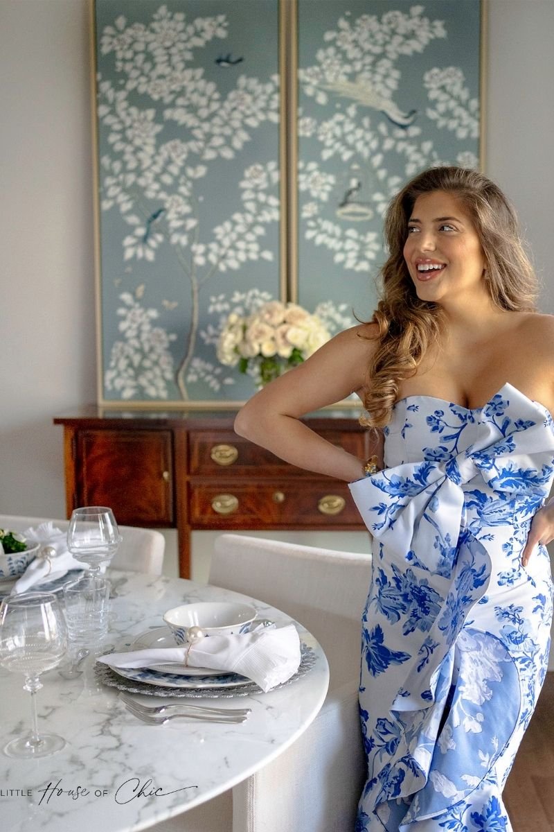
I wanted chinoiserie panels above the sideboard to add a pop of color. I found these Annette Hand-Painted Chinoiserie Panels that came in a set of three and absolutely fell in love. They are my favorite color, robin’s egg blue. I wanted to put the set of three above the piece, but they did not fit well because they are such a great, large size. So instead I opted to place only two of them in the dining room and placed the other one in my den. I love that they go all the way up to the ceiling. They add height to any room you put them in.
Once the panels were up, it finally felt like a well-balanced room.

Deeper Dive Into the Design
Throughout this process, I wanted no detail to be overlooked. I loved finding little ways to incorporate color into the space. For example, the blue paint on the wood of the french chairs complimented the blue tassels I place on my Louis Chest. Also, they both perfectly coordinated with the blue Chinoiserie panels to effortlessly tie the room together. Details all add up in the end to create personality within the room. Use those opportunities where you can to have some fun with the design.
Devil in the Details
For this dining room reveal, I worked with three of my favorite brands - Juliska, Mestiza New York, and Grace Rose Farm.
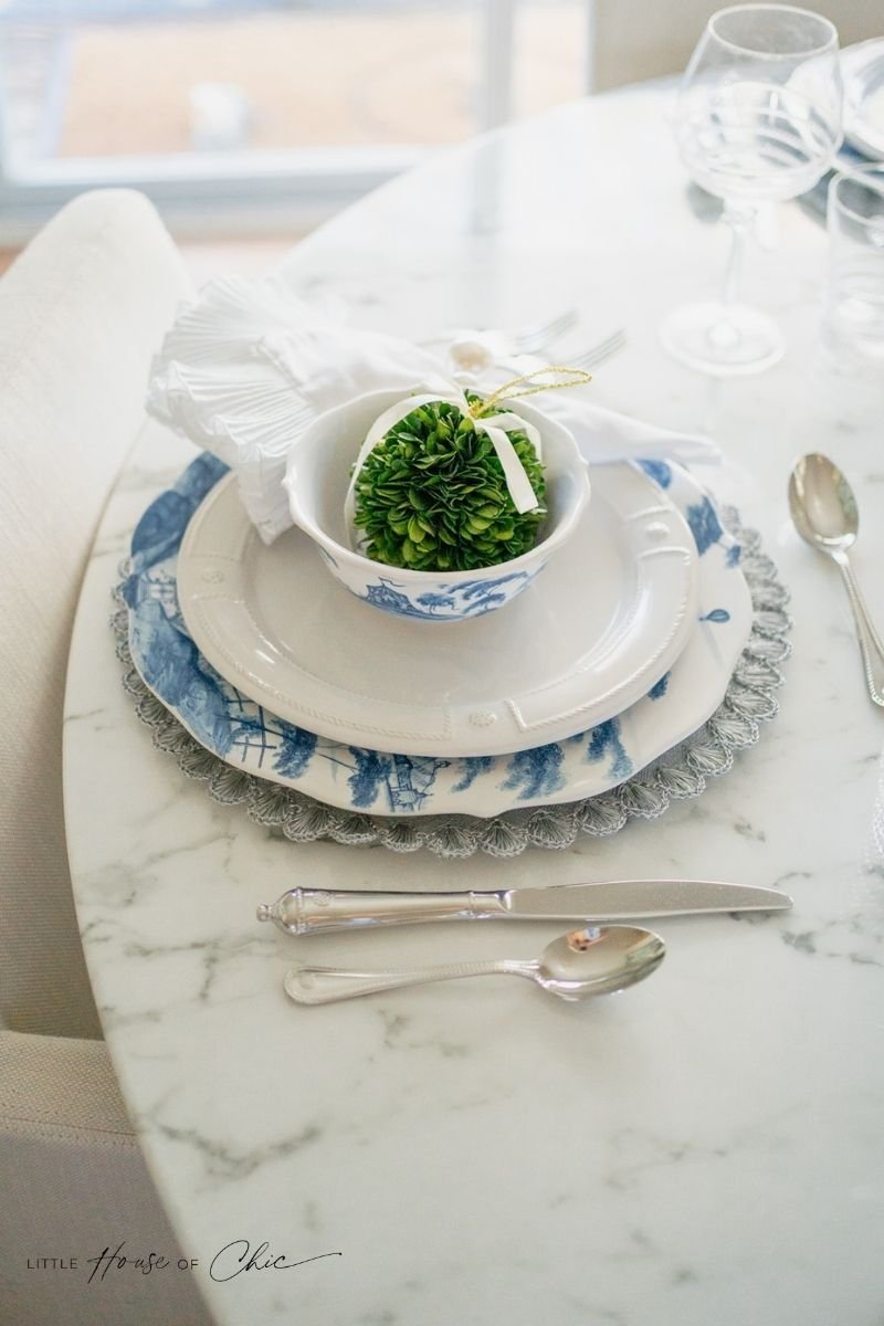
The table setting is from a brand I have cherished for years, Juliska. They have super high-quality, timeless products that can be used for special occasions or everyday life. I think every household should have some Juliska.

[show_shopthepost_widget id="4296341"]
For the room, I picked out their ultra classic blue Country Estate and Berry & Thread collections. The napkins are their Mademoiselle napkin. I love them because they feel dainty, fun, and feminine. They add a touch of elegance to the tabletop and I can't get enough of them!

For our flatware, we decided on their beautiful shiny Berry and Thread silverware, which I highly recommend. Most people don't think about the functionality of their silverware, and typically pick out something that looks good but might not function well. After having gone through multiple sets of silverware, I can promise you that these pieces are not only gorgeous, but they are also very functional.

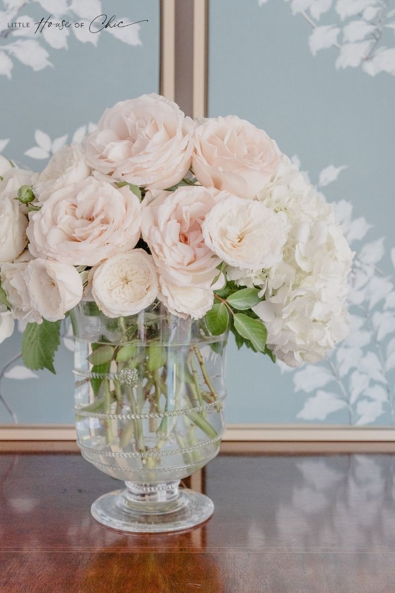
The flowers in the room are from Grace Rose Farm. Once my bouquets arrived, I made this gorgeous low arrangement mixed in with hydrangeas. I love how the roses look when they open and they smell absolutely heavenly. When I work with their flowers, I use rose gloves to handle them because they come with their thorns as a way of preserving the flowers for longer.

Grace Rose Farm is based in California, they have fast shipping, cute packaging, and a lot of colors to choose from. I got eight dozen roses and had enough leftover from the low arrangement to create another arrangement for my sideboard.

To coordinate with all of my beautiful decor, my favorite dress company, Mestiza New York, sent me their Stephanie bow dress. Mestiza knows how to create garments that fit a woman’s body very nicely. This dress fits like a dream, is super flattering, and the fabric is extremely high-quality. In a word, this dress is perfection.
I have been wearing their dresses throughout the year and I am fortunate that they recently named me one of their tastemakers.


